Guides
Chart Guides and Templates
Plain-English guides to chart types, histograms, scatter plots, Gantt charts and SVG, each with live examples you can open and edit in a free tool.
Chart types and how to read them
- 8 Bar Graph Examples With Data You Can Copy Eight bar graph examples with sample data you can copy: vertical, horizontal, sorted, grouped, stacked, negative and labeled, each with a question.

- Circle Graph: How to Draw One From Percents and Degrees A circle graph is a pie chart. Learn the formula that turns data into percentages and degrees, draw one with a compass and protractor, and read it.

- Donut Chart vs Pie Chart: When Each One Works A donut chart is a pie chart with a hole. See what the hole changes, what a donut chart does well, how to read one and when a bar chart is the better pick.

- Line Graph Examples and How to Read Them Seven line graph examples with charts, a question and an answer for each. Learn what a line graph shows, how to describe one, and when to use bars.

- Double Line Graph: What It Is, Examples and How to Read One A double line graph puts two lines on one grid so you can compare them. See examples, learn to read the gaps and crossings, and avoid common mistakes.

- Stacked Bar Chart: What It Is and When to Use One A stacked bar chart splits each bar into parts. See when it works, when it misleads, and how to read and build one, with live examples.

- Types of Graphs: 13 Charts and When to Use Each The 13 main types of graphs and charts, what each one shows and when to use it. Every type comes with a live example you can open and edit.

Histograms, scatter plots and statistics
- Bar Graph vs Histogram: What Is the Difference? A bar graph compares categories; a histogram shows how one set of numbers is spread out. See the differences side by side and learn which one to use.

- How to Create a Histogram in Excel: Chart, ToolPak and FREQUENCY Create a histogram in Excel with the built-in chart, the Analysis ToolPak or FREQUENCY. Set bin width, overflow and underflow bins, step by step.

- How to Make a Histogram by Hand, Step by Step Make a histogram by hand in eight steps: find the range, pick a class width, tally a frequency table and draw touching bars. One worked example.

- Line of Best Fit: How to Find, Draw and Use One on a Scatter Plot What a line of best fit is, how to draw one by eye or with least squares, how to read y = mx + b and R², and when the line lies. With live examples.

- Scatter Plot: What It Is, How to Read One, and Examples A scatter plot shows how two numbers relate. Learn to read direction, strength and outliers, spot correlation and when not to use one, with live examples.

- How to Make a Scatter Plot in Excel and Google Sheets Step by step: make a scatter plot in Excel or Google Sheets, add a trendline with its equation and R², plot several data sets, and show a third variable.

- Scatter Plot and Line of Best Fit Worksheets With Answer Keys Six free scatter plot and line of best fit worksheets with answer keys: correlation, predictions, outliers and residuals. Change the data in one click.

- What Is a Histogram? Definition, How to Read One and Examples A histogram shows how numbers are spread out by counting them in ranges. Learn to read one, spot its shape and pick bins, with live examples to edit.

Gantt charts, timelines and org charts
- How to Make a Gantt Chart in Excel, Step by Step Build an Excel Gantt chart from a stacked bar chart in five steps, fix the date axis, and copy a free template. Or skip Excel and make one in your browser.

- How to Make a Gantt Chart in Google Sheets Three ways to make a Gantt chart in Google Sheets: timeline view, a stacked bar chart and a conditional formatting grid, with a template table to copy.

- How to Make an Org Chart in Word, Excel, PowerPoint or Google Sheets Make an org chart in Word, Excel or PowerPoint with SmartArt, in Google Sheets from two columns, or from a spreadsheet list in your browser. Step by step.

- Timeline Examples: 10 Timelines for School, Work and Life 10 timeline examples for history, a biography, a life story, school, projects, a company, science, a trip and a day. See what to copy from each.

- What Is a Gantt Chart? A Gantt chart shows a project schedule as bars on a calendar. Learn its parts, how to read one, where it came from, and when to use something else.

- Free Timeline Templates to Edit or Download 21 free timeline templates for school, history, projects, weddings, travel and research. Edit one in your browser or download it as PNG or SVG. No account.

Venn diagrams
- Venn Diagram Examples: 2 and 3 Sets, With Solutions Venn diagram examples from easy to hard, each with a question and a solution: numbers, a survey with counts, three sets, an empty overlap, and kids' ideas.

- 3 Circle Venn Diagram: Regions, Examples and Template A 3 circle Venn diagram has seven regions plus the outside. Learn to name each region, fill one in, count it, and start from a free template.

SVG and vector images
- What Is SVG? The SVG File Format, Explained With an Example SVG is an image format made of text that describes shapes, so it stays sharp at any size. See what is inside an SVG file and how to open or make one.

- SVG vs PNG: Which Format for Logos, Web and Cutting? SVG stays sharp at any size, PNG stores pixels. Compare them for logos, websites, cutting machines and file size, with sizes we measured.

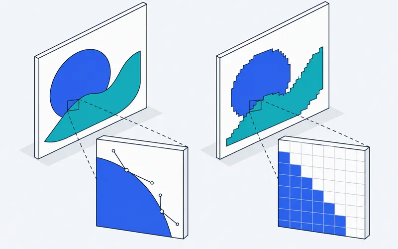
- Vector vs Raster Images: The Difference, With Examples Raster images are grids of pixels, vector images are shapes described by math. See the difference zoomed in, which formats are which, and what to use.